NBSC
New Brazilian Spirits Company
Brazilian Spirits. Simple Happiness.
Project Briefing
NBSC approached us requesting only a new website to replace a self-made, non-credible digital presence. A strategic assessment revealed a deeper issue: the brand identity did not reflect the quality, origin, or ambition of the product.
Core Problems Identified
Brand Inconsistency
The visual identity lacked coherence, personality, and memorability.
Misaligned Market Positioning
A commercial, generic aesthetic conflicted with a high-quality spirits offering.
Low Category Differentiation
Premium cachaça was being presented like a mass-market product.
Credibility Gap
The existing website failed to communicate trust to B2B buyers in a high-end European market.
Outcome of Briefing
A strategic decision was made to expand the scope from "website redesign" to a full brand repositioning, ensuring the digital presence would actually support the business.
Our Research
Category & Competitor Analysis
Spirits brands in the segment relied on flat logos, generic typography, and purely commercial language.
Cachaça Cultural Research
Deep research into Brazilian cachaça heritage, production, and cultural symbolism.
Market Context (Luxembourg & EU)
High-expectation, premium-oriented B2B buyers with strong visual literacy.
Brand Motivation & Founder Vision
Understanding the personal passion behind NBSC and its desire to elevate the category.
Audience Definition
Primary audience: distributors, bars, restaurants, and hospitality professionals — not end consumers.
Strategic Positioning Research
Exploration of how to merge Brazilian joy with European luxury standards.
Chosen Design Style
Strategic North Star
A fusion of Brazilian Carnival symbolism, the Golden Age aesthetic (1920s–30s elegance), and premium spirits visual language.
Luxury, but joyful.
Simple, but refined.
Color System
Primary Palette
Deep Emerald Green
Heritage, Sophistication
Gold
Quality, Celebration, Prestige
Secondary Accents
Muted, colorful tones inspired by Brazilian culture — used sparingly to maintain elegance. Colorfulness without excess. Joy without visual noise.
Warm Brown
Supporting
Soft Coral
Accent
Cream
Background
Charcoal
Text
Logo Construction
Logo Mark
A golden reinterpretation of the Rainha da Bateria (Queen of the Drumline), symbol of rhythm, leadership, and energy. Inspired by classic emblems such as Columbia Pictures and Rolls-Royce.
Letter Mark
NBSC initials with stars, reinforcing heritage and authority.
Word Mark
"New Brazilian Spirits Company" set in elegant, era-inspired typography.
The logo embodies:
- •Brazilian identity
- •Celebration and rhythm
- •Authority and premium positioning
Typography
Elegant serif typography with decorative swashes, inspired by early 20th-century luxury branding. Gold-accented headings paired with clean, readable body text.
Tone of Voice
Collaterals
Delivered Assets
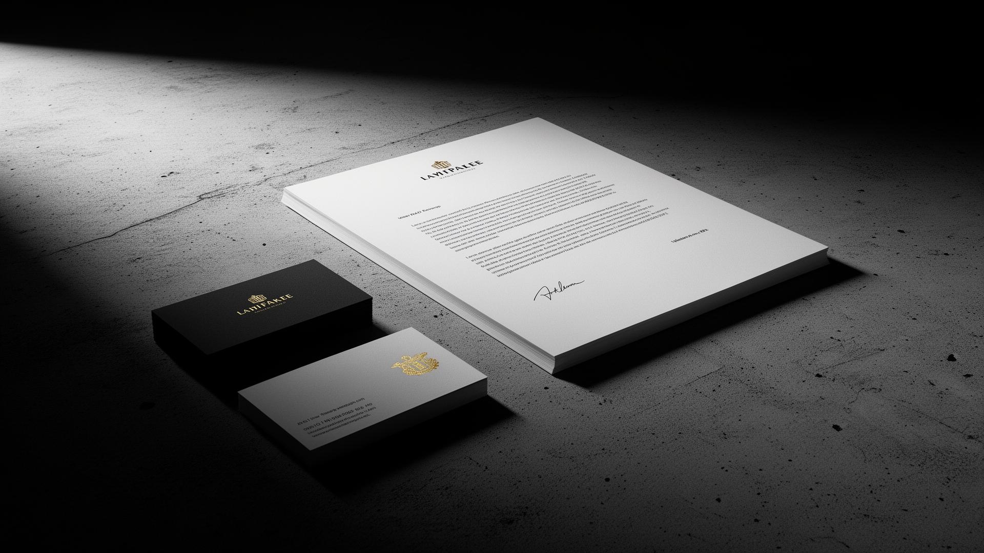
Business Cards
Premium cards maintaining brand elegance
Product Cards
Individual cards for each cachaça label
Event Materials
Print materials for brand activations
Social Templates
Social media templates (delivered, not retained)
Each asset was carefully adapted to maintain consistency across a large and diverse product range.
Web Design & Development
The NBSC website was fully coded from scratch, with no templates or builders, accommodating every specific request from the client.
Key Features
UX Focus
Events & Brand Activation
Event activations were executed in partnership with Nightlife Consulting.
Collaboration Model
- •Nightlife Consulting: concept, pricing strategy, operational flow
- •Our role: visual execution, digital assets, branding, print, and marketing materials
Objective
Position NBSC as:
- •Authentically Brazilian
- •Professionally structured
- •Market-ready for high-end hospitality environments
Impact & Results
Qualitative Outcomes
- •Complete brand repositioning from commercial to premium
- •Strong visual differentiation in a commoditized category
- •Immediate credibility with B2B buyers
- •Clear storytelling around cachaça culture and quality
- •A digital presence aligned with high-end European standards
Strategic Impact
- •Elevated perception of Brazilian cachaça as a refined spirit
- •Enabled the brand to compete visually with established spirits houses
- •Created a long-term brand foundation ready for growth and marketing
NBSC Spirits is an example of how strategy-led branding and custom digital execution can elevate an emerging product category and set a new standard from day one.
Note: The project concluded after brand and website delivery due to budgetary constraints on ongoing marketing and growth initiatives.